Set Up Template

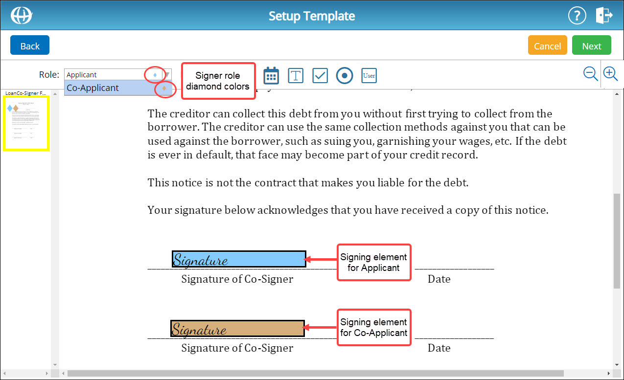
When creating a signing template, you must set up your desired signing elements on the template for each signer to complete. There are seven types of signing elements that can be added to a signing template: signature boxes, initials boxes, date boxes, text boxes, check boxes, radio buttons, and user fields. Signing elements are color-coded and correspond with a specific signer role. A signer role's color is indicated by the diamond to the right of that signer's name:
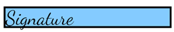
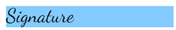
When setting up signing elements on a template, required elements can easily be distinguished from optional elements. Required signing elements are outlined in black while optional elements have no black outline:
|
Required Signing Element |
Optional Signing Element |
 |
 |
The visibility of some signing elements can be made dependent on the completion of another signing element. For more information, see About Signing Element Dependencies below.
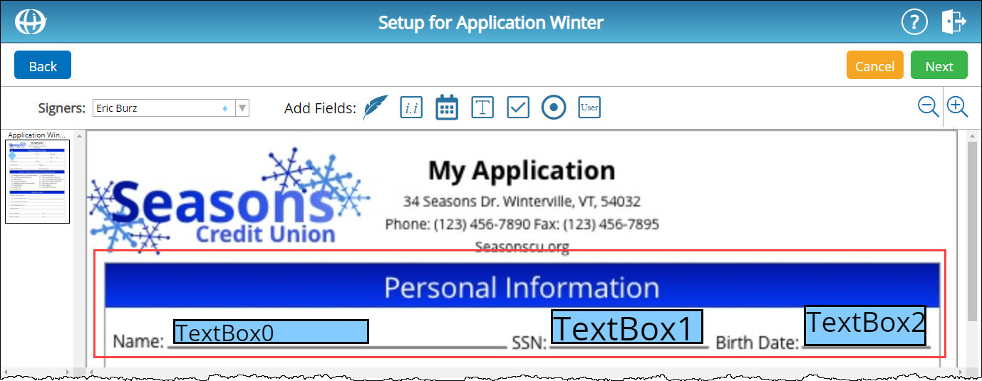
Tabbing order refers to the order in which signing elements are presented to a signer during the signing process. It is important to understand how the positioning of signing elements affects tabbing order for the signer. For more information, see About Tabbing Order below.
About Signing Element DependenciesAbout Signing Element Dependencies
If you are setting up a text box, check box, or radio button for a signer, you can make that element dependent on another signing element. A dependent signing element is not made visible to the signer until the signing element on which it is dependent is completed.
For example, if you are setting up a loan application, you may not want to make a " loan dollar amount" field visible to a signer until that signer indicates they have read the loan's terms and conditions. In that case, you can make the "loan dollar amount" field dependent on an "I agree" check box. When the signer affirmatively indicates they have read the loan's terms and conditions by checking the "I agree" box, the "loan dollar amount" field will then appear for the signer.
About Tabbing OrderAbout Tabbing Order
Tabbing order refers to the order in which signing elements are presented to a signer during the signing process. Typically, signers expect the document they receive to flow from left to right, proceeding down the document as signing elements are completed. The tabbing order of signing elements is based on the top-left position of each element. To ensure signing elements properly flow from left to right, if two or more elements fall on the same line of a document, the top-left position of each element needs to be the same height or lower than the preceding element:
|
Good Example |
Bad Example |
 |
 |
|
For more information on tabbing order, click here to read the tabbing order tech tip.
|
|
About Adobe Fillable PDF ConversionAbout Adobe Fillable PDF Conversion
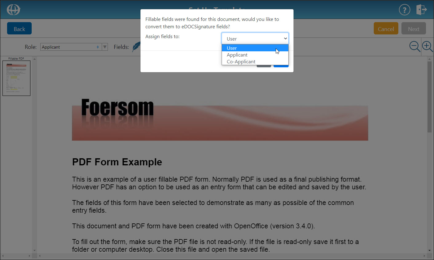
If you are creating a signing template using an Adobe Acrobat fillable PDF, eDOCSignature can automatically detect and convert fillable fields into eDOCSignature fields. This prevents you from having to recreate the fillable form in eDOCSignature.
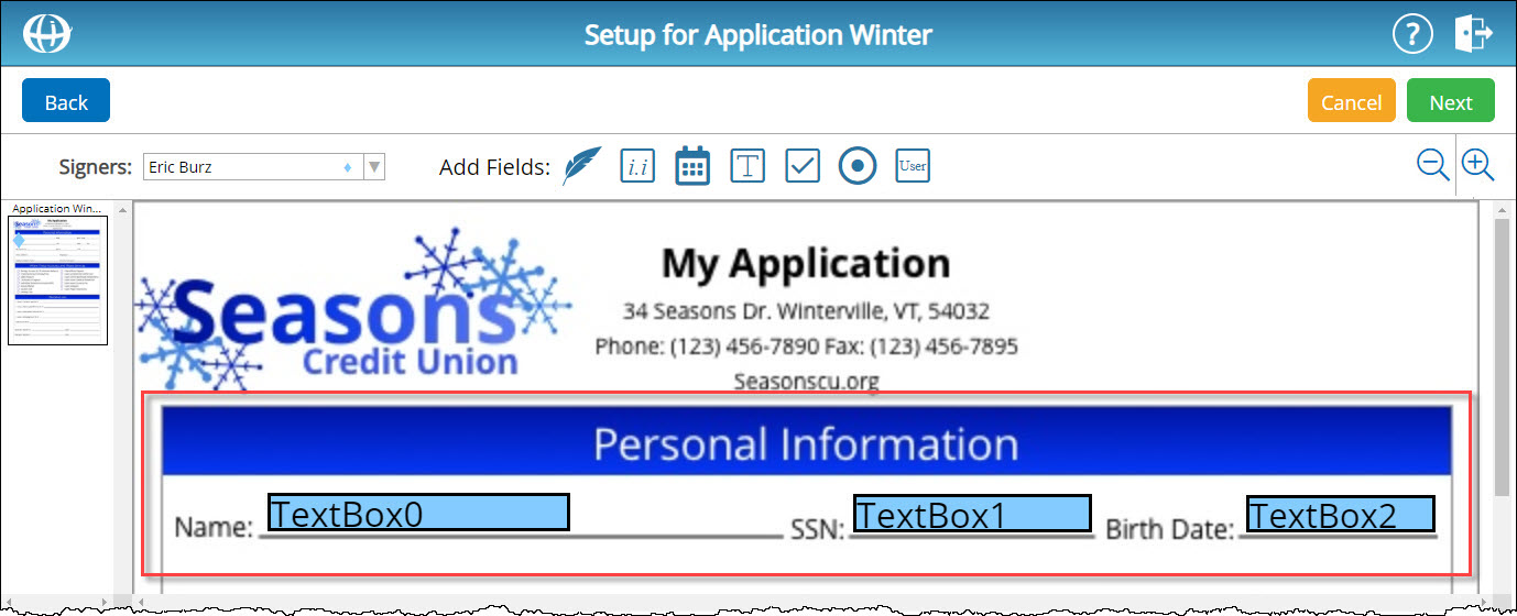
When a PDF file containing fillable fields is uploaded to eDOCSignature as a signing template, a pop-up window appears asking if you would like to convert the existing fillable fields. You can choose to convert the existing fields into user fields (i.e. fields to be completed by you, the user), or fields to be completed by a specific signer role assigned to the template:
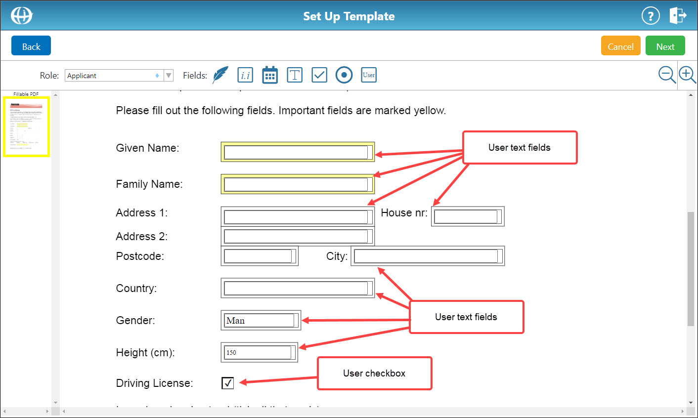
If you select user, all existing Adobe check boxes are converted into eDOCSignature user check boxes, and every other remaining Adobe fillable field is converted into an eDOCSignature user text field:
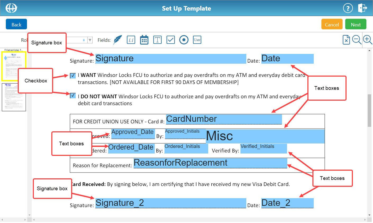
If you select a template role, all existing Adobe signature boxes are converted into eDOCSignature signature boxes, all existing Adobe check boxes are converted into eDOCSignature check boxes, and every other remaining Adobe fillable field is converted into an eDOCSignature text field:
Notes:
– Some fields, such as Date fields, are not automatically converted and will need to be manually replaced after the conversion process is complete. It is always recommended that you review and fix any converted templates before saving them.
– The Adobe Fillable PDF Conversion feature is specifically designed to convert PDF files created in Adobe Acrobat, but fillable forms created in other programs may also be compatible.
Set Up a Signing TemplateSet Up a Signing Template
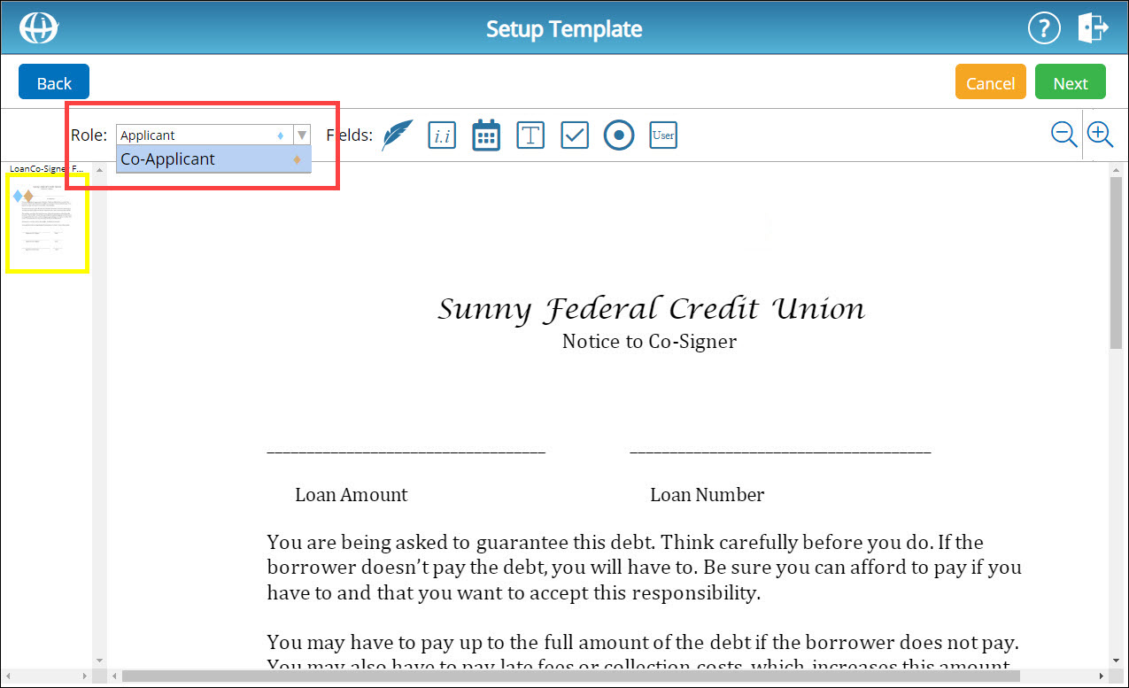
- To change the signer for whom you are setting up signing elements, from the Signers drop-down list, select a new signer.
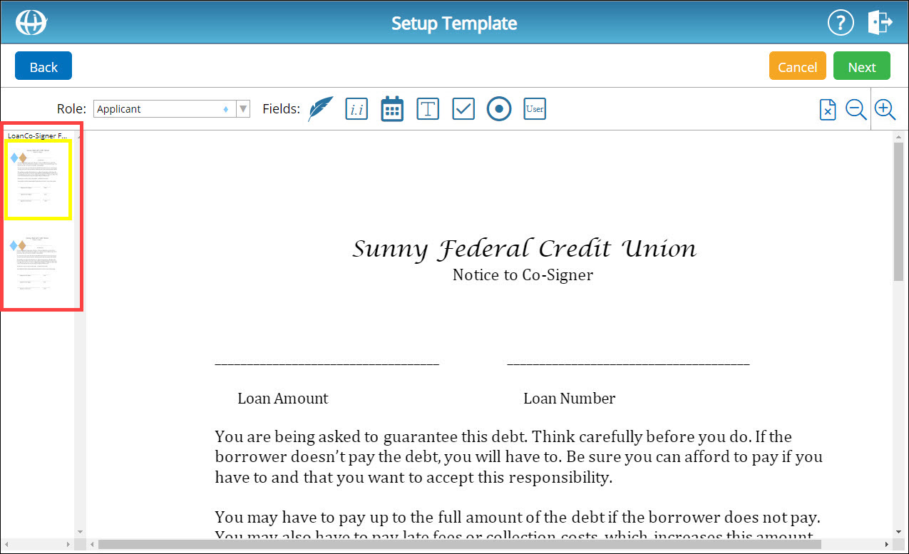
- If your document template contains multiple pages, you can select a specific page. To change pages on the template you are setting up, on the left-hand side of the screen, select a page.
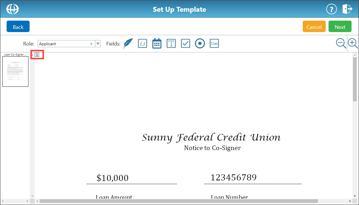
- To delete a page from the document template, scroll to the page you want to delete and click the delete page icon
 . The page you selected is outlined in a red box. In the confirmation box that appears, click Yes. The page is deleted from the document template.
 - To zoom in and out on the document template you are setting up, on the right-hand side of the screen, use the zoom in
 and zoom out
  icons.
 - There are seven signing element types that can be added to a signing template: signature boxes, initials boxes, date boxes, text boxes, check boxes, radio buttons, and user fields.
View Signing Element Type DescriptionsView Signing Element Type Descriptions
 Signature Box – When tapped or clicked, the signer's signature is automatically entered into this field.
  Initials Box – When tapped or clicked, the signer's initials are automatically entered into this field.
 Date Box – When tapped or clicked, the current date is automatically entered into this field.
  Text Box – A signer can freely enter information into this field.
 Check Box – When tapped or clicked, this box is either checked or unchecked.
  Radio Button – When tapped or clicked, this button is either selected or deselected. Radio buttons are typically set up in pairs and used to indicate an "either/or" selection (e.g. marital status).
  User Field – You (i.e. the package creator) can create a text box or check box and freely enter information into the field. Information entered into a user text box appears as written text and CANNOT be modified by the signer. User check boxes also CANNOT be modified by the signer.
Add Signature BoxAdd Signature Box
Click the signature box icon . A signature box is placed in the top-left corner of the document template.
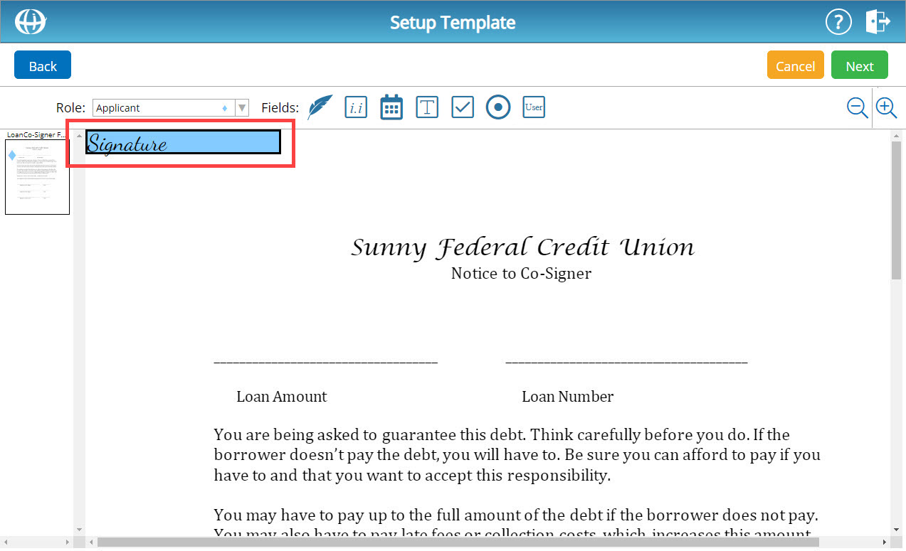
To reposition the signature box, click and drag the signature box.
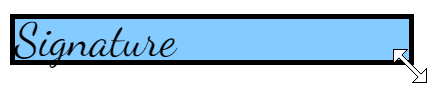
To resize the signature box, hover your cursor over the bottom-right corner of the element. The cursor changes to a double arrow.
To edit the signature box, double-click the signature box. A new window appears.
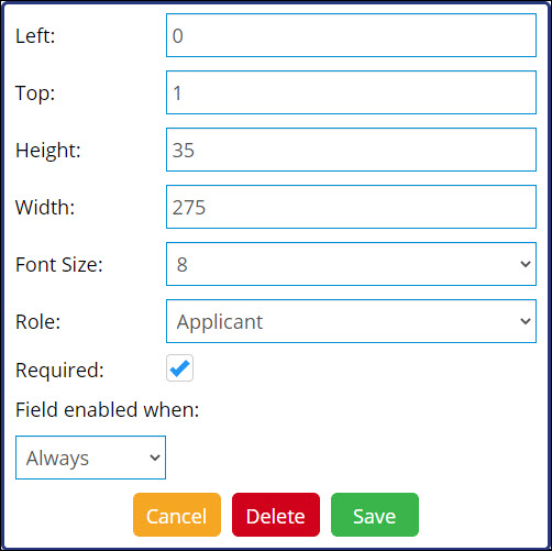
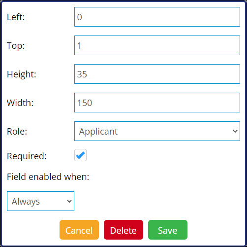
In the Left and Top fields, enter coordinates to reposition the box.
In the Height and Width fields, enter coordinates to resize the box.
From the Font Size drop-down list, select a signature font size.
To change the signer role for this signature box, from the Role drop-down list, select a new signer role.
To make this signing element required, leave the Required box checked. Otherwise, uncheck this box.
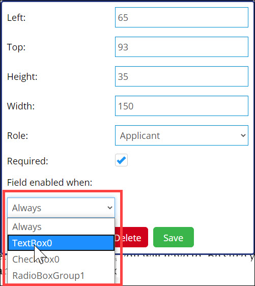
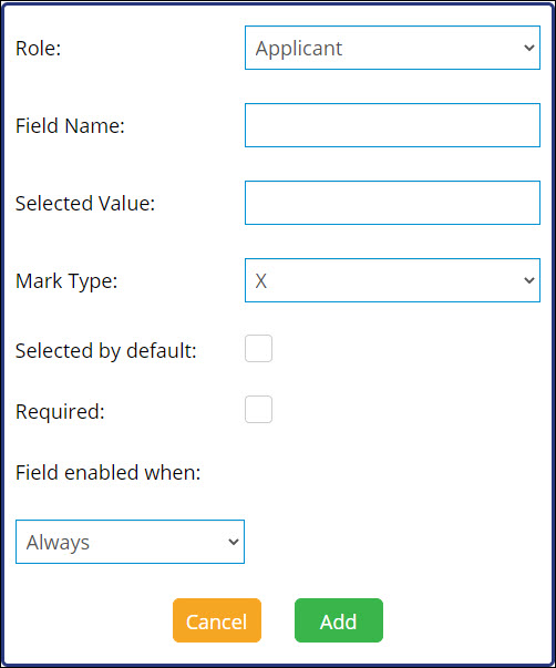
If a text box, check box, or radio button has been set up for the selected signer role on the current template, this signature box can be made dependent on one of those elements.
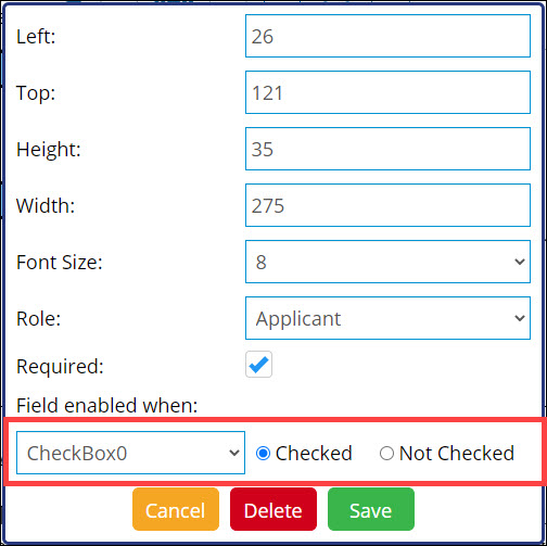
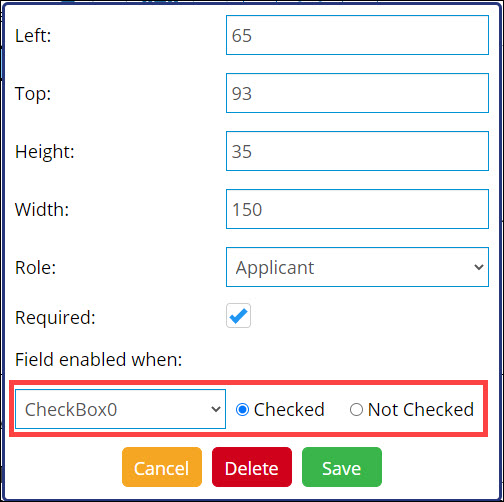
To change the signature box's element dependency, from the Field Enabled When drop-down list, select the appropriate signing element.
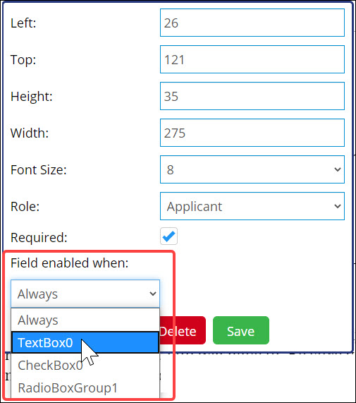
For the selected signing element, enter a qualifying value. For example, the screenshot below shows that the signature box will only appear when CheckBox0 is checked:
To cancel all changes made to the signature box, click Cancel.
To delete the signature box from the template, click Delete.
To save all changes made to the signature box, click Save.
Add Initials BoxAdd Initials Box
Click the initials box icon . An initials box is placed in the top-left corner of the document template.

To reposition the initials box, click and drag the box.
To resize the initials box, hover your cursor over the bottom-right corner of the element. The cursor changes to a double arrow.
To edit the initials box, double-click the initials box. A new window appears.

In the Left and Top fields, enter coordinates to reposition the box.
In the Height and Width fields, enter coordinates to resize the box.
To change the signer role for this intials box, from the Role drop-down list, select a new signer role.
To make this signing element required, leave the Required box checked. Otherwise, uncheck this box.
If a text box, check box, or radio button has been set up for the selected signer role on the current template, this initials box can be made dependent on one of those elements.
To change the initials box's element dependency, from the Field Enabled When drop-down list, select the appropriate signing element.
For the selected signing element, enter a qualifying value. For example, the screenshot below shows that the initials box will only appear when CheckBox0 is checked:
To cancel all changes made to the initials box, click Cancel.
To delete the initials box from the template, click Delete.
To save all changes made to the initials box, click Save.
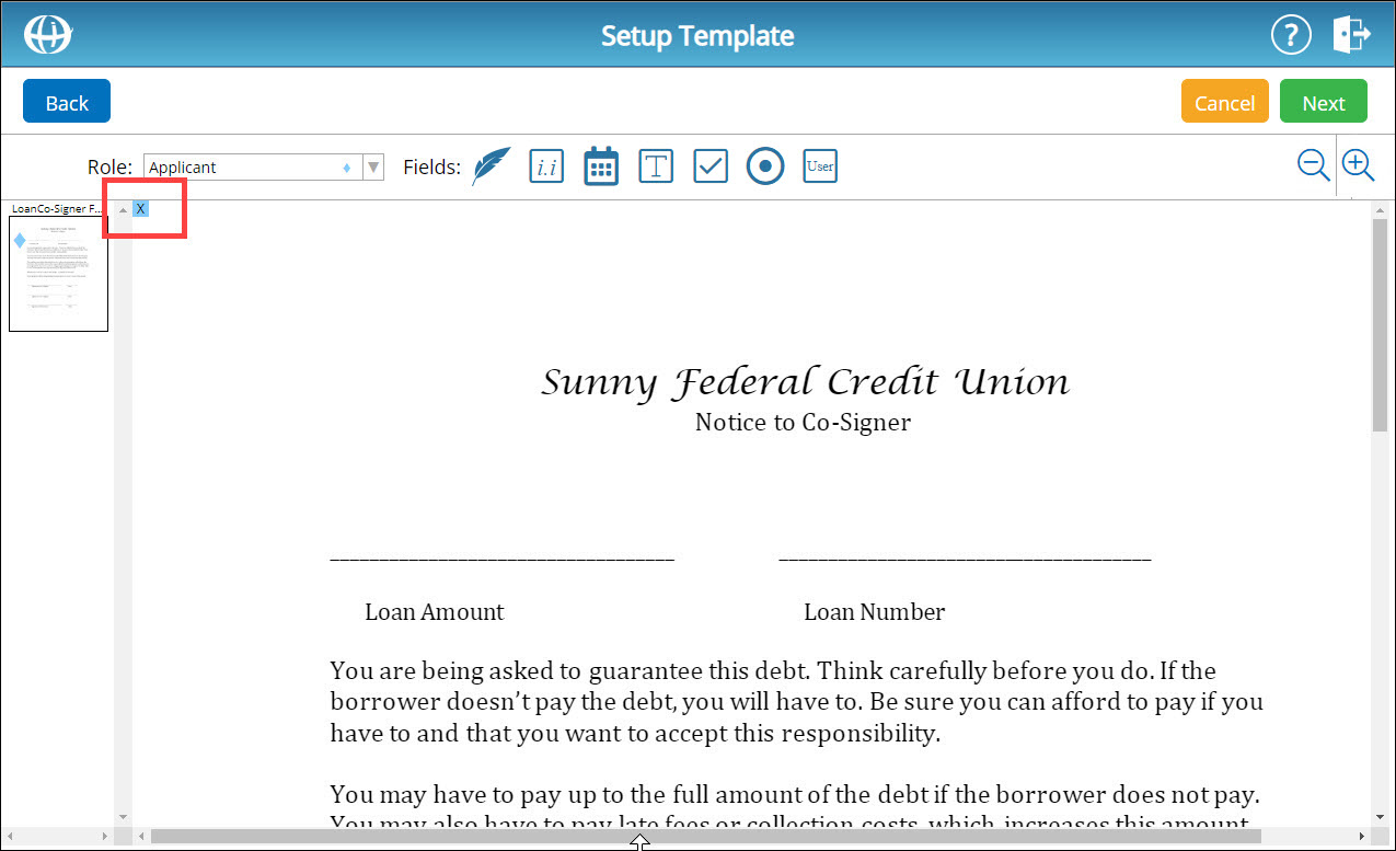
Click the date box icon . A date box is placed in the top-left corner of the document template.
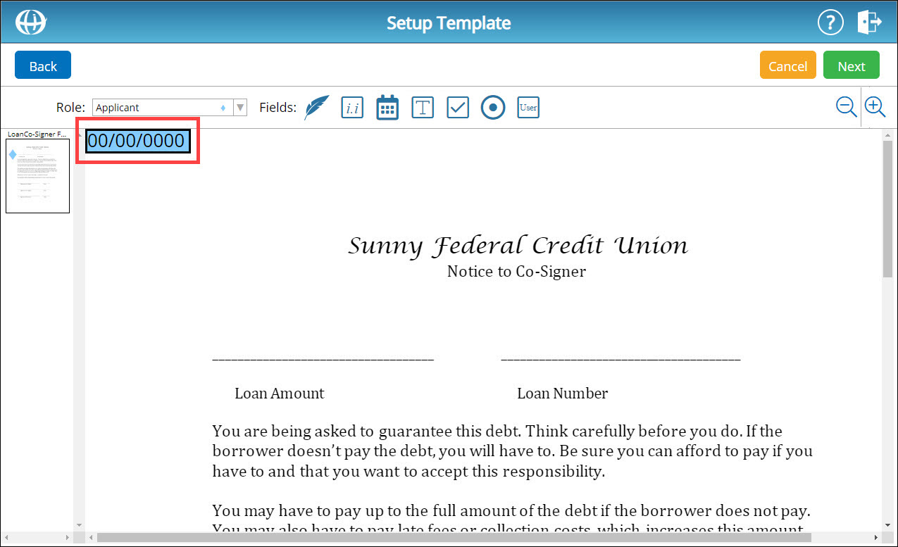
To reposition the date box, click and drag the box.
To resize the date box, hover your cursor over the bottom-right corner of the element. The cursor changes to a double arrow.
To edit the date box, double-click the date box. A new window appears.
In the Left and Top fields, enter coordinates to reposition the box.
In the Height and Width fields, enter coordinates to resize the box.
To change the signer role for this date box, from the Role drop-down list, select a new signer role.
To make this signing element required, leave the Required box checked. Otherwise, uncheck this box.
If a text box, check box, or radio button has been set up for the selected signer role on the current template, this date box can be made dependent on one of those elements.
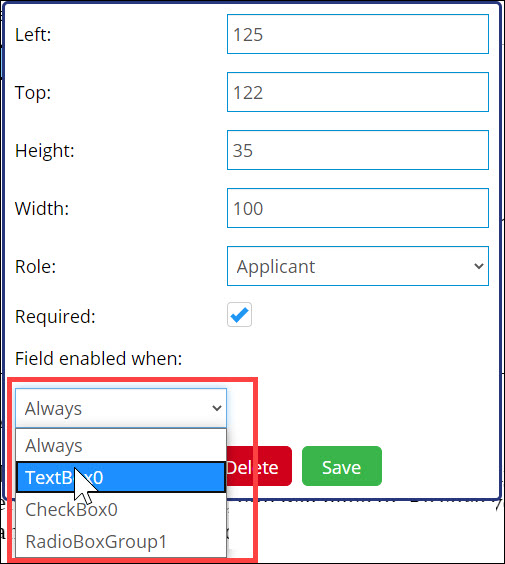
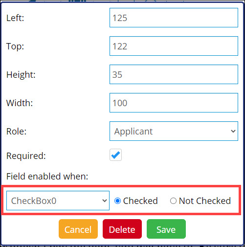
To change the date box's element dependency, from the Field Enabled When drop-down list, select the appropriate signing element.
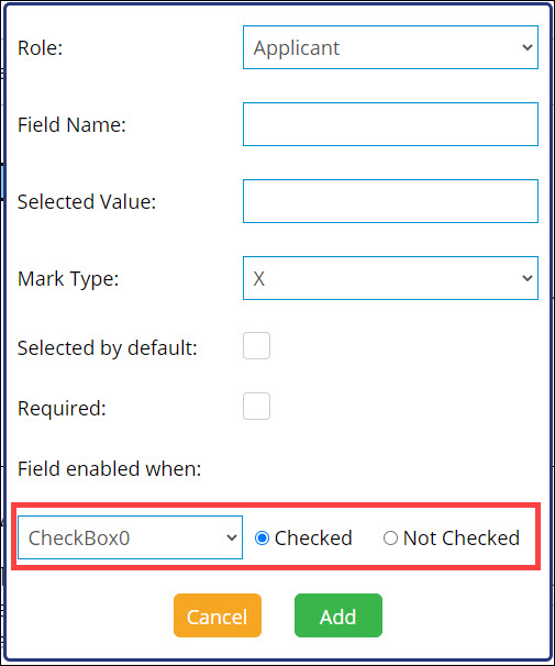
For the selected signing element, enter a qualifying value. For example, the screenshot below shows that the date box will only appear when CheckBox0 is checked:
To cancel all changes made to the date box, click Cancel.
To delete the date box from the template, click Delete.
To save all changes made to the date box, click Save.
Click the text box icon . A new window appears.
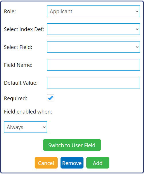
To change the signer role for this text box, from the Role drop-down list, select a new signer role.
If desired, select an index definition from the Select Index Def field. From the Select Field name, select an index field.
In the Field Name field, enter a name for the text box field.
Note: Field names cannot contain any spaces.
If desired, in the Default Value field, enter a default value for the text box field.
To make this signing element required, leave the Required box checked. Otherwise, uncheck this box.
If a check box, radio button, or another text box has been set up for the selected signer role on the current template, this text box can be made dependent on one of those elements.
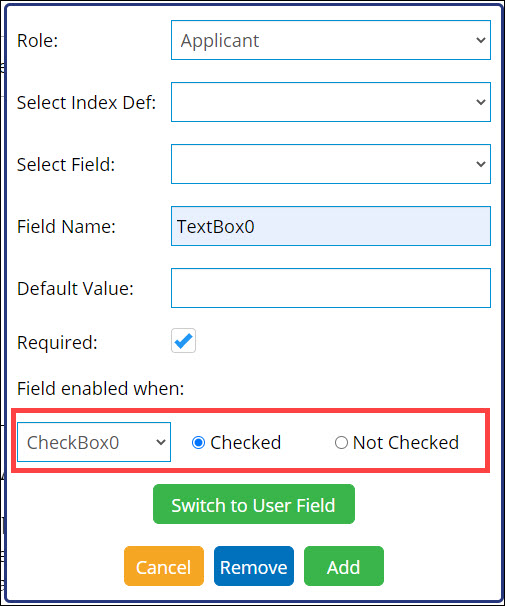
To change the text box's element dependency, from the Field Enabled When drop-down list, select the appropriate signing element.
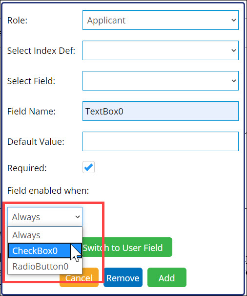
For the selected signing element, enter a qualifying value. For example, the screenshot below shows that the text box will only appear when CheckBox0 is checked:
Click Add. The text box is added to the template.
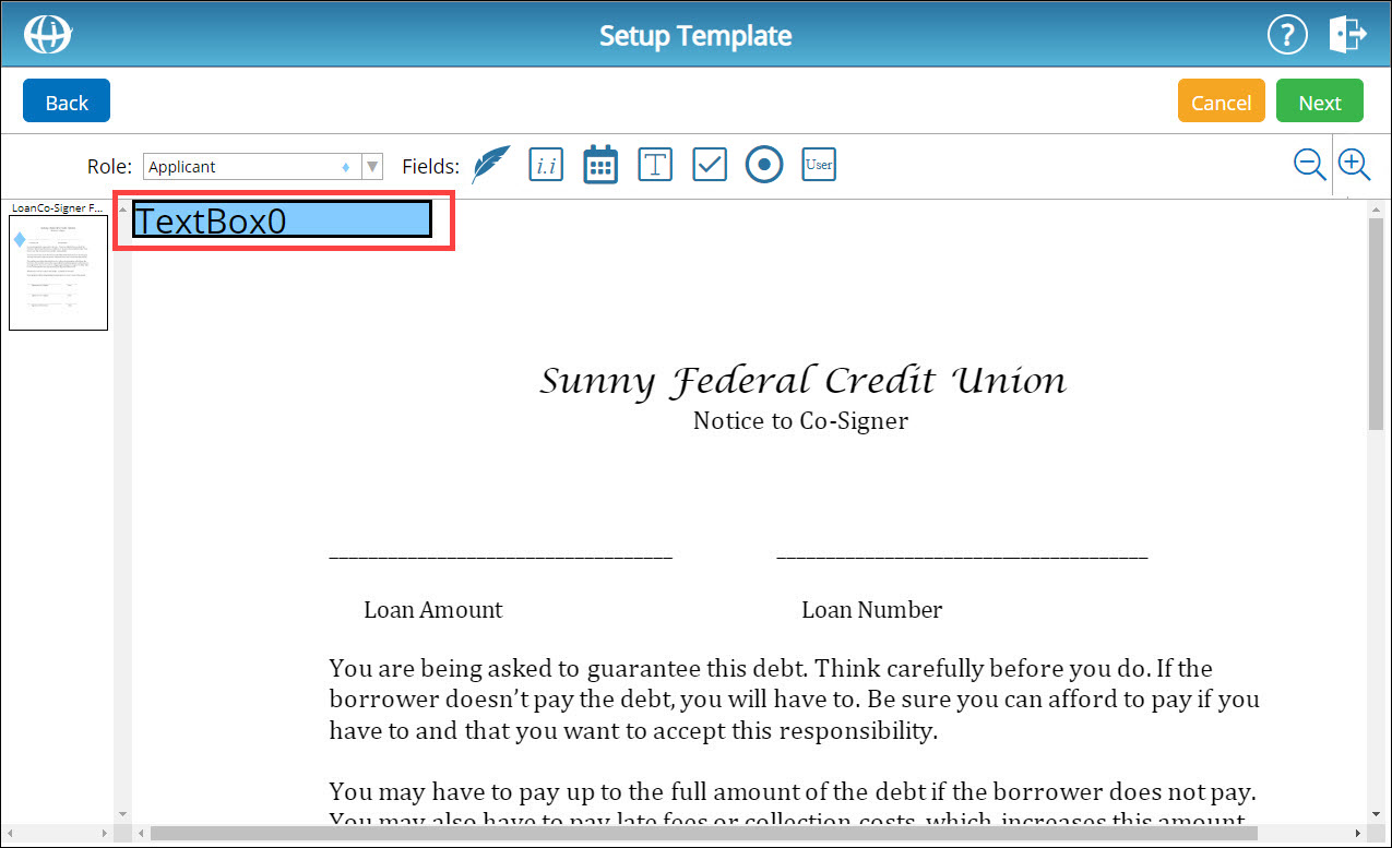
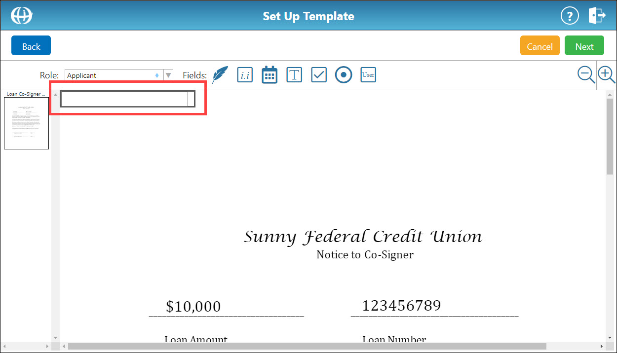
To reposition the text box, click and drag the box.
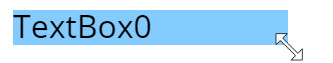
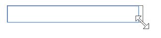
To resize the text box, hover your cursor over the bottom-right corner of the element. The cursor changes to a double arrow.
To edit the text box, double-click the text box. A new window appears.
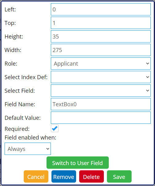
In the Left and Top fields, enter coordinates to reposition the box.
In the Height and Width fields, enter coordinates to resize the box.
To quickly change the text box to a user field, click the Switch to User Field button.
To cancel all changes made to the text box, click Cancel.
To clear the Select Field value, click Remove.
To delete the text box from the template, click Delete.
To save all changes made to the text box, click Save.
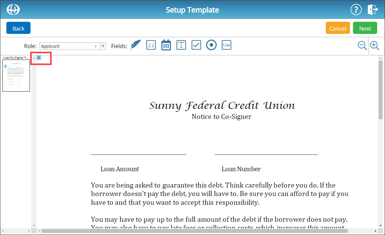
Click the check box icon . A new window appears.
To change the signer role for this check box, from the Role drop-down list, select a new signer role.
In the Field Name field, enter a name for the check box field.
Note: Field names cannot contain any spaces.
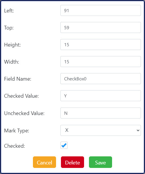
In the Checked Value field, enter a value for the check box when checked (ex. "Y" for "yes" or "N" for "no").
In the Unchecked Value field, enter a value for the check box when checked (ex. "Y" for "yes" or "N" for "no").
From the Mark Type drop-down list, select a mark type for the check box.
To make this check box field checked by default, select the Checked by default box.
To make this signing element required, check the Required box. Otherwise, uncheck this box.
If a radio button, text box, or another check box has been set up for the selected signer role on the current template, this check box can be made dependent on one of those elements.
To change the check box's element dependency, from the Field Enabled When drop-down list, select the appropriate signing element.
For the selected signing element, enter a qualifying value. For example, the screenshot below shows that the check box will only appear when RadioButton0 is checked:
Click Add. The check box is added to the template.
To reposition the check box, click and drag the box.
To resize the check box, hover your cursor over the bottom-right corner of the element. The cursor changes to a double arrow.
To edit the check box, double-click the check box. A new window appears.
In the Left and Top fields, enter coordinates to reposition the box.
In the Height and Width fields, enter coordinates to resize the box.
To cancel all changes made to the check box, click Cancel.
To delete the check box from the template, click Delete.
To save all changes made to the check box, click Save.
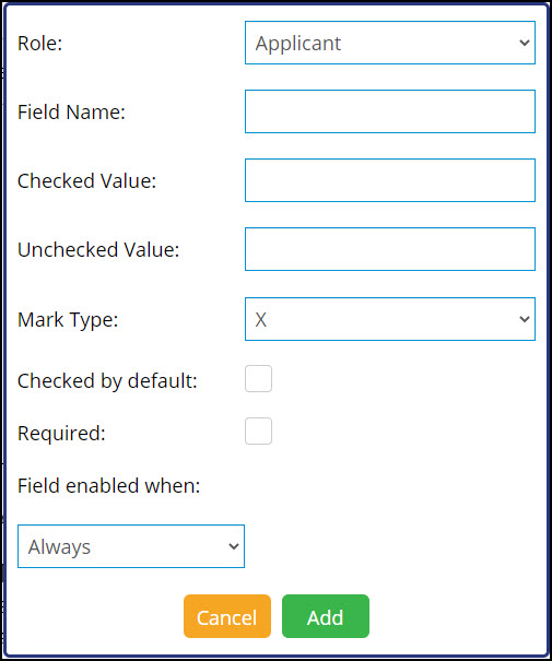
Add Radio ButtonAdd Radio Button
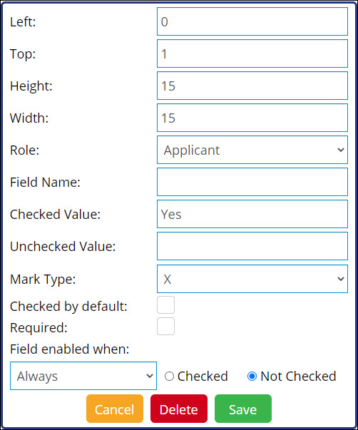
Click the radio button icon . A new window appears.
To change the signer role for this radio box, from the Role drop-down list, select a new signer role.
In the Field Name field, enter a name for the check box field.
Note: Field names cannot contain any spaces.
From the Mark Type drop-down list, select a mark type for the radio button.
In the Selected Value field, enter a selected value for the radio button field.
To make this radio button field selected by default, check the Selected by default box.
To make this signing element required, check the Required box. Otherwise, leave this box unchecked.
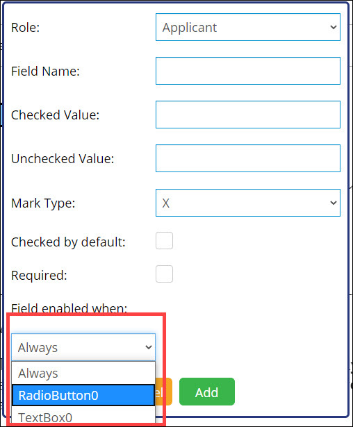
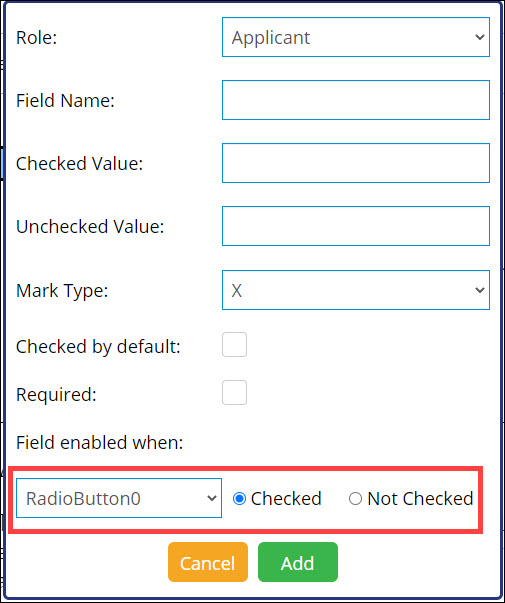
If a text box, check box, or another set of radio buttons has been set up for the selected signer role on the current template, this radio button can be made dependent on one of those elements.
To change the radio button's element dependency, from the Field Enabled When drop-down list, select the appropriate signing element.
For the selected signing element, enter a qualifying value. For example, the screenshot below shows that the radio button will only appear when CheckBox0 is checked:
Click Add. The radio button is added to the template.
To reposition the radio button, click and drag the box.
To resize the radio button, hover your cursor over the bottom-right corner of the element. The cursor changes to a double arrow.
To edit the radio button, double-click the radio button. A new window appears.
In the Left and Top fields, enter coordinates to reposition the radio button.
In the Height and Width fields, enter coordinates to resize the radio button.
To cancel all changes made to the radio button, click Cancel.
To delete the radio button from the template, click Delete.
To save all changes made to the radio button, click Save.
Add User Field – Text BoxAdd User Field – Text Box
Click the user field icon . From the drop-down list that appears, select Text Field. A user text field is placed in the top-left corner of the document.
To reposition the user text field, click and drag the field.
To resize the user field, hover your cursor over the bottom-right corner of the element. The cursor changes to a double arrow.
To edit the user text field, double-click the user field. A new window appears.
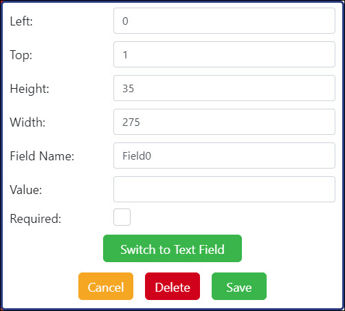
In the Left and Top fields, enter coordinates to reposition the user text field.
In the Height and Width fields, enter coordinates to resize the user text field.
In the Field Name field, enter a one-word field name.
In the Value field, enter a value for the user text field.
To make this signing element required, check the Required box. Otherwise, leave this box unchecked.
To quickly change the user text field to a signer text field, click the Switch to Text Field button.
To cancel all changes made to the user text field, click Cancel.
To delete the user text field from the document, click Delete.
To save all changes made to the user text field, click Save.
Add User Field – Check BoxAdd User Field – Check Box
Click the user field icon . From the drop-down list that appears, select Check Box. A user check box is placed in the top-left corner of the document.
To reposition the user check box, click and drag the box.
To resize the user check box, hover your cursor over the bottom-right corner of the element. The cursor changes to a double arrow.
To edit the user check box, double-click the user check box. A new window appears.
In the Left and Top fields, enter coordinates to reposition the box.
In the Height and Width fields, enter coordinates to resize the box.
In the Field Name field, enter a name for the user check box.
In the Checked Value field, enter a value for the user check box when checked (ex. "Y" for "yes" or "N" for "no").
In the Unchecked Value field, enter a value for the user check box when unchecked (ex. "Y" for "yes" or "N" for "no").
From the Mark Type drop-down list, select a mark type for the user check box.
To add a mark to this user check box, check the Checked box.
To cancel all changes made to the user check box, click Cancel.
To delete the user check box from the document, click Delete.
To save all changes made to the user check box, click Save.
- When all desired signing elements have been added to the document, click Next to continue to the Sharing screen.